
What makes someone stop in their tracks and step inside a store? It’s rarely just the product itself. The environment, the layout, the colours, the mood – all of it plays a part. That’s where visual merchandising comes in. Done well, it pulls people in and keeps them browsing. Done poorly, and it can drive them straight out the door.
So, how do you make sure you’re getting it right?
Table of Contents
The Role of Visual Merchandising
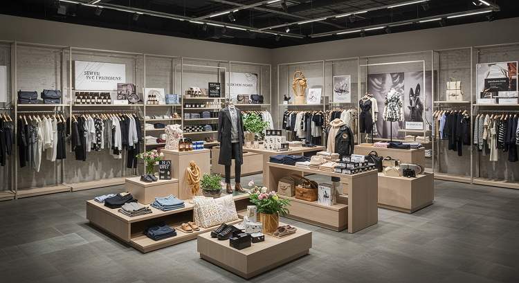
Visual merchandising displays are about creating an intentional, sensory experience. It guides the customer journey and shapes how people feel in a space. You’re not just putting products on shelves. You’re building a story, creating a mood, and nudging people toward the choices you want them to make.
This could mean:
- Choosing the right lighting to highlight certain products.
- Positioning stock at different heights to create depth and movement.
- Using seasonal themes to keep things fresh and relevant.
- Organising by colour, price, category or purpose.
When it’s done right, people notice. They feel comfortable, intrigued and inspired to spend time exploring.
Common Pitfalls You Need to Avoid
It’s surprisingly easy to get visual merchandising wrong, especially when rushing or trying to do too much at once. A few key mistakes crop up time and time again.
Overcrowding
Cramming too much into a single space is a surefire way to confuse and overwhelm customers. People need space to see and think. Clutter kills clarity.
Inconsistent themes
Switching between styles, colours or moods within the same zone makes things feel disjointed. Stick with a clear theme, and let that lead every decision.
Poor lighting
Lighting matters more than many realise. If it’s too harsh, too dark, or badly placed, it doesn’t matter how great the display is. No one will linger long enough to care.
Lack of flow
Your store should tell a story from the front entrance all the way to the back. If customers feel lost or directionless, they’re unlikely to stick around.
Neglecting key zones
Focal points, corners and transitional spaces need just as much attention as the central areas. Don’t let dead zones drag the whole experience down.
First Impressions: The Entrance Matters
That initial view from the outside is more powerful than people realise. The window display and entrance are doing the heavy lifting, attracting attention and communicating what the store is all about.
To get this part right:
- Keep it simple – A clean, striking display works far better than something packed with information or clutter.
- Update regularly – Freshness builds curiosity and repeat visits.
- Be bold – Use contrast, light, and scale to your advantage.
- Tell a story – Focus on a single theme or campaign, and let it unfold visually.
This is where bold, well-designed visual merchandising displays play a huge role. They set expectations and spark that all-important curiosity that leads to a footstep across the threshold.
Layout That Encourages Exploration
The way your space is laid out should guide the customer naturally, not with signs and arrows, but through smart positioning and visual cues.
Think about how people move. They’ll usually turn right after entering, so use that space wisely. Position hero products or eye-catching features here. Use lighting, floor materials, or changes in ceiling height to subtly steer the journey.
It helps to build in ‘speed bumps’ – smaller displays or product zones that encourage people to pause, take a closer look and slow down. This creates more opportunities for interaction and, ultimately, purchasing.
Also, keep vertical space in mind. Shelving at eye level gets the most attention, while lower levels are great for value-led options. Make every level count.
Colour, Texture and Detail
Visual merchandising isn’t only about where things go. It’s also about how they look together.
Colour can influence emotions and buying behaviour more than many realise. Warm tones can make a space feel inviting and cosy. Cooler shades can lend a more premium, minimal vibe.
Texture is often overlooked, but it’s crucial. A mix of finishes, like wood, glass, fabric, and metal, adds depth and richness to the environment. This variety encourages the senses to engage.
Small details, too, make a huge difference. The finish of a shelf. The neatness of a folded display. The symmetry of a stack. These things may seem subtle, but they build a sense of care and quality that customers will associate with your products.
Keep Things Moving: Why Regular Updates Matter
Visual merchandising is never one-and-done. Even the best-designed space will lose its impact if it stays the same for too long.
Changing displays, refreshing layouts and rotating stock are essential parts of the process. People want novelty. Even regular customers expect things to evolve.
Set a realistic schedule for updates. Seasonal changes are the obvious time to refresh, but there’s no harm in switching things up monthly or even weekly, depending on your traffic and stock levels.
It doesn’t always have to be a full reset. Swapping out props, changing signage, or adjusting lighting angles can all breathe new life into a familiar space.
Keep It Working Hard
Once a display goes live, the job isn’t over. Maintenance is part of good merchandising. Dust builds up. Signs get smudged. Products get moved.
Make time for regular check-ins. Tidy, restock, straighten and refresh. These little touches keep things looking sharp and show that care has been taken.
Bring It All Together
Getting visual merchandising right doesn’t mean being flashy or over the top. It means being thoughtful, consistent and willing to adapt.
Start with the experience you want to create, then let that shape every element – from the lighting and layout to the textures and signs. Keep your displays clean, fresh and relevant. Make sure your products shine, and your space supports them at every level.
And above all, remember: you’re not just setting up a shop floor. You’re building an experience that invites people in and keeps them coming back.
Done well, that’s what visual merchandising is all about.