
Missing a dose. Taking the wrong pill. Skipping one completely. Medication errors happen more than we like to admit, and often, the consequences aren’t just minor — they’re life-altering. The problem? Adherence. The solution? Thoughtful, functional, user-centered technology.
Medication reminder app development isn’t just about sending push notifications. It’s about designing a tool that understands people, adapts to their needs, and helps them follow their treatment plans. If you want to develop a medication management app that truly works — not just in theory, but in the lives of real users — you need to start with empathy, not code.
Let’s break it down.
Table of Contents
Understanding User Needs and Behaviors
Who are your users?
Not everyone taking medication is a tech-savvy 30-year-old. You’re designing for elderly users with tremors, busy parents juggling five routines at once, chronically ill teens navigating brain fog, or stroke survivors with partial vision. They all have one thing in common: they need help remembering their medication — but they don’t want another complicated tool in their lives.
To build a solution that sticks, you have to talk to them. Not guess. Surveys are a start, but interviews go deeper. Sit with them. Watch them struggle with pill bottles and blinking notifications. Ask: What makes them forget? Is it timing, side effects, emotions, complexity? Once you have answers, build a system around their behavior — not around a list of generic features.
Usability testing isn’t a phase. It’s a conversation. Run sessions early, often, and with people who represent real-life use cases, not just ideal personas. What seems evident to your design team might be a complete mystery to someone with mild cognitive impairment.
Core Features of an Effective Medication Reminder System
Now, let’s talk about what the app should do. Not everything, not 300 features. It’s just what matters most. And here’s your only list — seven core features that can make or break the user experience:
- Customizable reminder schedules
- Multi-channel notifications (e.g., push, SMS, email)
- Easy medication input and management
- Integration with wearable devices
- User-friendly interface and navigation
- Data privacy and security measures
- Feedback and progress tracking
Let’s unpack a few. Customizable reminder schedules mean flexibility — morning meds on weekends, noon meds on weekdays, skipped days, and dosage windows. Real people don’t take pills at perfect 12-hour intervals, and your app shouldn’t assume they do.
Multi-channel notifications let users choose: a subtle buzz, a loud alarm, or a friendly text. Someone managing anxiety might want silence, while someone caring for a loved one might need duplicate alerts.
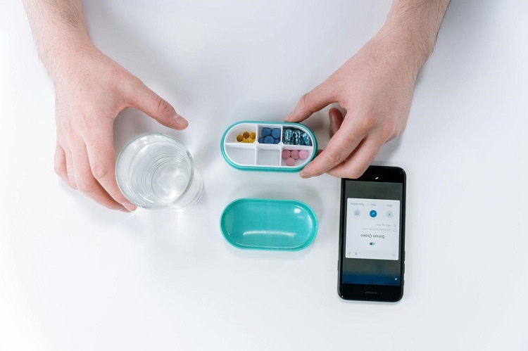
Integration with wearable devices brings a hands-free experience and bridges gaps. Does your reminder sync with their watch? That’s convenient. Do you connect with a blood pressure monitor? That’s data-driven care.
All of this, of course, only works if the app is simple to navigate. If users must click through five menus to mark a dose taken, you’ve already lost them.
Designing for Accessibility and Inclusivity
Design isn’t good if it’s not accessible.
For visual impairments, offer contrast modes, resizable text, and voice readouts. For motor impairments, minimize swipes, make buttons large, and add voice control. For cognitive disabilities, use icons, avoid jargon, and provide guided flows.
And language — don’t assume everyone reads at a college level or speaks the same tongue. Localization isn’t just lovely; it’s necessary. Add visual instructions for those who don’t read fluently.
This isn’t just about ethics or compliance—although accessibility standards like WCAG are non-negotiable—it’s about business, too. Inclusive design means more users, more engagement, and more impact. If you want to create a medication management app that people recommend, start by ensuring everyone can use it.
Leveraging Technology and Integration
Here’s where the system can go from functional to indispensable.
When your reminder app connects with electronic health records (EHRs), it syncs with prescriptions. When it integrates with pharmacy systems, it can track refills and suggest reorders. When plugs into smart pill dispensers, it can confirm whether the medication was taken — not just whether a button was tapped.
Wearables? Think about heart rate monitoring before beta-blockers. Think hydration tracking before diuretics. These small connections can make your app more than a schedule — they make it a partner in care.
Don’t overbuild, though. Every integration adds complexity. Choose wisely. Add value, not noise.
And always remember privacy. Health data is sacred. Use end-to-end encryption, never store unneeded data, and let users decide what gets shared and with whom.
Ensuring User Engagement and Retention
Let’s be honest: even the best app gets deleted if it’s boring, nagging, or confusing.
Engagement doesn’t mean flashing badges or dopamine loops. It means helping users stay consistent without pressure—a gentle nudge, a congratulatory message after a perfect week, a subtle reminder when they miss a dose—not a guilt trip, just support.
Gamification can help — but only if it feels meaningful. Earning a gold star for taking meds might work for some, but others want a chart showing their progress or a message from their doctor saying, “You’re doing great.”
Avoid notification fatigue like the plague. It lets users control frequency, tone, and even silence mode. Let them snooze a reminder, not just cancel it.
Most importantly, listen. Give them a way to share feedback, report bugs, and request features—and then act on it. This isn’t just software—it’s a lifeline. Treat it like one.
Testing and Iteration Based on User Feedback
No app gets it right on version 1.0.
Even with the best research and cleanest UI, people will surprise you. They’ll use features in ways you didn’t predict. They’ll ignore buttons you thought were obvious. And some will uninstall without a word.
That’s why iteration matters. Your design team needs to run tests not once but every quarter. Test with new users, longtime users, and people who have never used an app before.
Track behavior. See what gets ignored. What confuses? What delights. Don’t just collect feedback — analyze it. Build sprints around it. Evolve consistently.
Build a medication management app that learns and improves — not one that gets launched and forgotten.
Conclusion
At its core, medication reminder app development isn’t about alerts and screens. It’s about trust. You’re asking users to depend on you to help them care for their health daily.
If you want to develop a medication management app that users adopt — and keep — you have to start with them. Design with empathy. Build with clarity. Test with humility. Support with consistency.
Don’t just build a medication management app that looks good in the App Store. Build one that earns a place on someone’s home screen, between the photos of their grandkids and their banking app, because that’s when it’s real. That’s when it works.
And that’s when you’ve made a difference.